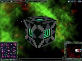
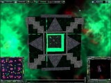
 Armada 3 Concept Omega Cube for A2
A very nice file here from Yacuzza...yet again! Brilliant work my man, keep up the good work
Armada 3 Concept Omega cube for A2
by Yacuzza - comrad01nuk@net.hr
19/04/05.
--------------------------------------------------------------------------
Ok this is Armada 3 Concept Omega cube,
Powerd by particle 010 this super advanced cube has trans regeneration shield's, omega hull armor,
advanced shield's remodulation, tactical transformation ability and is very heavly armed.
--------------------------------------------------------------------------
Install:
Run instaler use Browse button to select the destination folder. select the default Star Trek Armada 2 directory.
--------------------------------------------------------------------------
Legal Stuff
Copyright and Distribution Permissions
--------------------------------------
THIS PATCH IS NOT MADE, DISTRIBUTED, OR SUPPORTED BY ACTIVISION.
TM & (C) ACTIVISION & PARAMOUNT PICTURES.
This Mod shall not be sold or used for any other mod.
Thank you.
/Graphy/Yacuzza/
---------------------------------------------------------------------------
Yacuzza
19
/
04
/
2005.
---------------------------------------------------------------------------
| Version | Author | Yacuzza | Website | ||
| Downloads | 1,919 | Size | 1.74 MB | Created | 2005-05-09 |


Comments
WE ARE THE
My only problem with this ship is the layout of the grey outer shell (what I assume to be its armor). It is far too patterned and really does spoil the whole look. It should have more of a random look to make it look more like a borg design. The armored sections are technically supposed to protect the ships primary systems, not to try and make the ship look nice (notice I said try
My only problem with this ship is the layout of the grey outer shell (what I assume to be its armor). It is far too patterned and really does spoil the whole look. It should have more of a random look to make it look more like a borg design. The armored sections are technically supposed to protect the ships primary systems, not to try and make the ship look nice (notice I said try
My only problem with this ship is the layout of the grey outer shell (what I assume to be its armor). It is far too patterned and really does spoil the whole look. It should have more of a random look to make it look more like a borg design. The armored sections are technically supposed to protect the ships primary systems, not to try and make the ship look nice (notice I said try